Showing posts with label Album Artwork. Show all posts
Showing posts with label Album Artwork. Show all posts
Friday, 8 April 2011

Thursday, 7 April 2011
Final Album Artwork
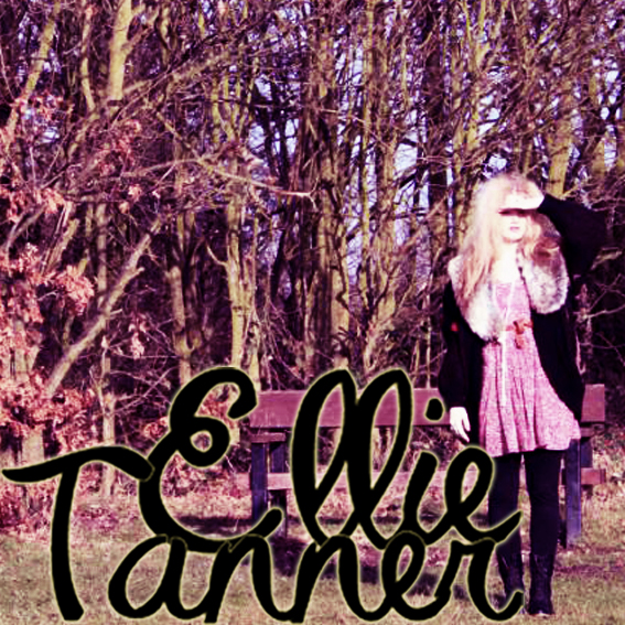
Here is my final choice of front cover and my back cover:


I chose this front cover for various reasons. Firstly the eye contact between the artist and the customer is really engaging and will draw customers in. I also really like the mis-en-scene. The combination of the sophisticated fur shrug and the slightly tussled hair is a nice contrast that will appeal to her target audience. The misty forest setting gives the image a very organic and natural feel which will appeal to her audience. I position the subject to use the natural light to create this halo behind her head, which along with the setting gives a really etherial quality. I have obeyed the usual conventions of a debut album, by making it self-titled (artists name is album name), by having her name as the largest text on the page and by including a picture of the artist like both Kate Nash and Adele did with their debuts.
The back cover adds to the rustic, home-made style, using ripped wallpaper and the hanging frame. The font I used for the track names is the same as I have used throughout her website and advert. I have used the conventions of having her record labels logo, copyright information, a track list, a barcode and the artist website address.
Final Album Artwork
Here are my final album artwork and I am really pleased with the out come. They really fit with Ellie's Image and they are fitting with the other elements.



Wednesday, 6 April 2011
Album Artwork Summary
After doing research into album arts and the different conventions they must adhere to, I have decided that in order create the right style and image for my artist there are some certain things I need to do. I have been particularly inspired by the album art of Kate Nash, as I believe that Ellie falls into a very similar genre.
Kate Nash has a very bubbly and youthful personality that is shown in her music and I believe that Ellie is the same, although her music would appeal to an older market as well. This is something I had to consider when choosing the font for her brand logo/name. I had to get the right mix between youthfulness and fun, and class and maturity so that it enables her to appeal to a wide audience or age range. I also wanted the font to be lasting so when you see that style or font in years to come it would be associated with my artist.
One thing I noticed whilst looking at album art, websites and adverts was that there is often an ancillary font. Whilst I wanted to convey a more grown up and classic feel with the “logo,” I wanted my ancillary font to be a juxtaposition that evokes an innocent and youthful feeling. The two fonts I have chosen are a completely different. I wanted them both to have a handwritten style, to give real and raw connotations, avoiding an overproduced look. I decided that I wanted the second font to be more like a child’s writing. I decided this when I listened to some more of Ellie’s music and talking to her about what her inspiration was. I found that the common theme was her youth (teen years) and I wanted to exaggerate this idea in my font choice.
When thinking about her image I really wanted to play on the idea of her British/English nationality, as being British is a very fashionable at the moment, with many people liking the idea of tea drinking classic Brits. They enjoy the romanticism of it all. I like the idea of the back cover being a wall from an old English house, with worn floral wall paper and a gold photo frame, that may hang slightly wonky. This will hopefully convey a very rustic image, that is commonly seen within her genre. An example could be Angus & Julia Stone’s “Down the Way.” It uses a really old photo that looks like it has faded in the light, which gives it real authenticity. I might achieve this look on album art by decreasing the saturation level and maybe adding a tan coloured filter.

During my research process I noticed that an artist’s debut album is often self titled. This is done as the debut album is an introduction to this new artist, so their name being the only text gives it real significance. This is something I will employ on Ellie’s Album. I have also decided that because it is her debut album I am going to use an image of her as the front cover, this is to introduce her visually, so that we establish her “look.” I want the image to be really natural and for it to have this an aged and authentic feel to it.
Along with the above the I noticed particular conventions I will have to include:
- Barcode on back cover
- Record Label Logo
- Copyright Information
- Artist Name
- Album name
- Track List (numbered, or in order of play)
Thursday, 31 March 2011
Artist Logo

Here is my chosen font for my artist. By looking at already established artists websites and album covers, I have learnt that the logo used for the album art is conventionally used in the header for the website. This helps create a consistent and continuous artist image.
I have also created a small abbreviated version of the logo, that would be used on the drum skin and merchandise.

Wednesday, 30 March 2011
Final Album Images
I have edited all of my images and using photoshop and I have cropped them so that the proportions are correct for the Jewel CD case, and for the digipak. I have two different varieties of image, ones shot at the cafe and ones that I shot in the forest. I have decided to use the forest Images for the Album cover, and the ones shot in the cafe for the Single. Here are my images:


I am now going to add my text in the chosen fonts to create my final product.
Album Artwork- Photos
Here are the photos I have taken for my album artwork. I am going to use photoshop to edit them to create my final product.


The Beatles- Sgt. Pepper's Lonely Hearts Club Band

To help me understand the codes and conventions that are needed within album art I decided to look at this revolutionary and iconic Beatles album. Here are my notes on what I found:


Nirvana- Nevermind

I have decided to look at Nirvana's "Nevermind" album as it was an innovative and groundbreaking album. Here are my notes below:

Although my artist is nowhere near the same genre as Nirvana, I believe that I have learnt a lot from the composition of this album art, and the fonts used to create the band image.
Oasis- Definitely Maybe

I have decided to look at one of an Oasis album cover as they are one of the biggest british bands of all time. Oasis lead the way in the "Brit Pop" movement of the early 1990s, drawing on influences from successful bands of the 1960s, such as The Beatles. Their songs were brilliantly written and had were intended to make statement about what was occurring culturally, politically and musically in the UK at the time. This movement was a combatant for the invasion of American grunge bands that was happening at the time.
I believe that we can draw parallels between that movement and the current situation in the UK music industry. Towards beginning of this millennium the UK market was saturated with hip-hop, R 'n' B and Pop artists coming over from America, but since 2006 we have seen a revival of British music, with new artist such as Adele, Lily Allen and Tinie Tempah making the debuts. I believe that we are now in a Golden Age of British Music, with more British artists succeeding in "breaking america," and I think that the way Adele's new album has dominated world charts going straight to number one in more than 20 countries so far, with one of the tracks "Someone Like You" having a record breaking 9 consecutive weeks at number one.
I think that my artist fits into this new age Brit Pop movement and I therefore thought it would be a good idea to look at some of Oasis' Album art. Here are my notes below:


Font Research
I went on 1001fonts.com and searched through the fonts and made a list of fonts that I think suit my artist and her image. I was conscious that the fonts have to fit with the images, I therefore have chosen a variety different styles, that communicate Ellie's Image.


Tuesday, 29 March 2011
Kate Nash- Made of Bricks

To help me in the process of creating my Album Artwork for Ellie Tanner, I have decided to look at Kate Nash's "Made of Bricks" album. I have chosen to look at Kate Nash because as an artist she falls into a similar genre to that of Ellie.
This is Kate Nash's Debut Album and the artwork is really important as it is the first impression we get of her as an artist, before we even hear her music. For this reason her name is larger than the title of the album, because it is introducing her and establishing her brand. This is a convention I have seen in many other artist's debut albums, like the ones below:


In the foreground of the album we have the artist, with her back to the audience but she is facing around. This gives the feeling that she is going/ walking somewhere, but by turning her head towards the audience it is as if she is inviting us to go to this place/ on her musical journey with her. Her pose is an allusion to that of the iconic Marilyn Monroe (below), who was one of the sexiest pinups of the 20th century.

The artist clothes in this cover convey a sultry and sexy feeling. This because red carries connotations of sex, passion and love, but also anger and fire. I believe that this is a statement about her music but also her personality, as Kate Nash's lyrics are very playful and romantic but also fiery, feisty and punchy, especially the "foundations" track.
In this cover I think Nash wanted to convey her pride of where she has come from. I think she has done this through the background. The house is quintessentially english and with the red clay tile roof, and white wood window frames. The house almost looks like a dolls house, which also adds to the playful feeling. The pruned hedges have middles class connotations and therefore could be an allusion to the artist background. These structured hedges are contrasted against the overgrown grass and daisies.
It is noticeable that Kate Nash is superimposed and I think that the designer has done this on purpose as a postmodern technique making us aware that what we are looking at isn't real. It's done to show us that they aren't pretending it is either.
To help me when I create my back cover for my album, I have also looked at the back of "Made of Bricks" to see how the Kate Nash's production team created a cohesive packaging.

There are certain conventions that I will need to adhere to when creating my back cover, such as a barcode, track list, copyright information and record label logo. These will all be things that I will look to include when I create my back cover.
The playful writing used on the front cover is carried over to continue the artists brand image. As a whole it is a very simplistic back cover, but I think it works well with the front cover as the front cover is fairly complex so it is made for purpose. It isn't made as a piece of art it is more for function. This idea is something that I will keep in mind when I create my album designs.
As a whole I really like this album and the playful concept. The text used has inspired me to use a similar font in my designs as it will contrast well with the logo/ brand font of Ellie Tanner.
Subscribe to:
Posts (Atom)