Friday 8 April 2011
Thursday 7 April 2011
Advert
Here is my final advert for my artists Album:


As you can see I have used the same fonts throughout the construction of my media products which I believe helps to identify Ellie as a musician and by doing so creates an association between this font and Ellie. I have tried to keep it really simple as I didn't want to clutter it with information that would detract from the ultimate intention which is to sell/advertise the album.
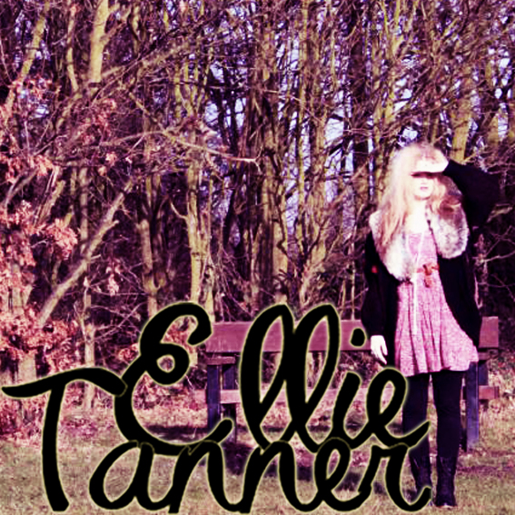
Final Album Artwork
Here is my final choice of front cover and my back cover:


I chose this front cover for various reasons. Firstly the eye contact between the artist and the customer is really engaging and will draw customers in. I also really like the mis-en-scene. The combination of the sophisticated fur shrug and the slightly tussled hair is a nice contrast that will appeal to her target audience. The misty forest setting gives the image a very organic and natural feel which will appeal to her audience. I position the subject to use the natural light to create this halo behind her head, which along with the setting gives a really etherial quality. I have obeyed the usual conventions of a debut album, by making it self-titled (artists name is album name), by having her name as the largest text on the page and by including a picture of the artist like both Kate Nash and Adele did with their debuts.
The back cover adds to the rustic, home-made style, using ripped wallpaper and the hanging frame. The font I used for the track names is the same as I have used throughout her website and advert. I have used the conventions of having her record labels logo, copyright information, a track list, a barcode and the artist website address.
Final Album Artwork
Here are my final album artwork and I am really pleased with the out come. They really fit with Ellie's Image and they are fitting with the other elements.


Wednesday 6 April 2011
Album Artwork Summary
After doing research into album arts and the different conventions they must adhere to, I have decided that in order create the right style and image for my artist there are some certain things I need to do. I have been particularly inspired by the album art of Kate Nash, as I believe that Ellie falls into a very similar genre.
Kate Nash has a very bubbly and youthful personality that is shown in her music and I believe that Ellie is the same, although her music would appeal to an older market as well. This is something I had to consider when choosing the font for her brand logo/name. I had to get the right mix between youthfulness and fun, and class and maturity so that it enables her to appeal to a wide audience or age range. I also wanted the font to be lasting so when you see that style or font in years to come it would be associated with my artist.
One thing I noticed whilst looking at album art, websites and adverts was that there is often an ancillary font. Whilst I wanted to convey a more grown up and classic feel with the “logo,” I wanted my ancillary font to be a juxtaposition that evokes an innocent and youthful feeling. The two fonts I have chosen are a completely different. I wanted them both to have a handwritten style, to give real and raw connotations, avoiding an overproduced look. I decided that I wanted the second font to be more like a child’s writing. I decided this when I listened to some more of Ellie’s music and talking to her about what her inspiration was. I found that the common theme was her youth (teen years) and I wanted to exaggerate this idea in my font choice.
When thinking about her image I really wanted to play on the idea of her British/English nationality, as being British is a very fashionable at the moment, with many people liking the idea of tea drinking classic Brits. They enjoy the romanticism of it all. I like the idea of the back cover being a wall from an old English house, with worn floral wall paper and a gold photo frame, that may hang slightly wonky. This will hopefully convey a very rustic image, that is commonly seen within her genre. An example could be Angus & Julia Stone’s “Down the Way.” It uses a really old photo that looks like it has faded in the light, which gives it real authenticity. I might achieve this look on album art by decreasing the saturation level and maybe adding a tan coloured filter.

During my research process I noticed that an artist’s debut album is often self titled. This is done as the debut album is an introduction to this new artist, so their name being the only text gives it real significance. This is something I will employ on Ellie’s Album. I have also decided that because it is her debut album I am going to use an image of her as the front cover, this is to introduce her visually, so that we establish her “look.” I want the image to be really natural and for it to have this an aged and authentic feel to it.
Along with the above the I noticed particular conventions I will have to include:
- Barcode on back cover
- Record Label Logo
- Copyright Information
- Artist Name
- Album name
- Track List (numbered, or in order of play)
Thursday 31 March 2011
Artist Logo

Here is my chosen font for my artist. By looking at already established artists websites and album covers, I have learnt that the logo used for the album art is conventionally used in the header for the website. This helps create a consistent and continuous artist image.
I have also created a small abbreviated version of the logo, that would be used on the drum skin and merchandise.

Wednesday 30 March 2011
Final Album Images
I have edited all of my images and using photoshop and I have cropped them so that the proportions are correct for the Jewel CD case, and for the digipak. I have two different varieties of image, ones shot at the cafe and ones that I shot in the forest. I have decided to use the forest Images for the Album cover, and the ones shot in the cafe for the Single. Here are my images:


I am now going to add my text in the chosen fonts to create my final product.
Album Artwork- Photos
Here are the photos I have taken for my album artwork. I am going to use photoshop to edit them to create my final product.


The Beatles- Sgt. Pepper's Lonely Hearts Club Band

To help me understand the codes and conventions that are needed within album art I decided to look at this revolutionary and iconic Beatles album. Here are my notes on what I found:


Artist's Website- Research
With advances in technology and the development of the internet the way we access music has changed too. These changes mean the way artists/ bands promote themselves has had to alter also. As part of the supporting task I have decided to create a website for my artist.
Websites allow artists to promote themselves online, acting like a virtual business card almost, but it also provides somewhere for existing fans to keep up to date with what the band is doing, when the text gigs are and if they have new material soon to be released.
To help me create my website I have decided to look at some artist/band websites, this will give me a deeper understanding of what to include and how to compose my website.
Below are some websites I have looked at and my thoughts and feelings about them:
Adele- http://www.adele.tv/home


- This is a very simple yet classic website design.
- I like the layout using boxes over the top of a faint image of the artist.
- The way the image used for the album cover is echoed in the background gives us a continuous and consistent representation of the artist.
- Artists name is biggest thing on page. Important as it needs to be the first thing we see.
- sophisticated/ grow up colour scheme
- Mailing list
- videos integrated to home page
The XX- http://thexx.info/

- Less conventional that Adele site.
- Strong brand- X in the centre with footage behind it
- Brand colour scheme used (black &white) used throughout album art, videos and merch.
- Simple Links
- Newsletter sign up, like adele's
- option to play track
- links to myspace page, itunes and amazon
- contact info
I have noticed that a lot of artists also have a merchandise website attached where fans can order official products. For this reason I have decided to look at the format of "The XX" shop.

In keeping with the artist image and style the shop is very simple with a continuation of the black and white colour scheme. It has the artists logo at the top and all produce has the artist logo incorporated. By looking at this I have had lots of ideas for my website for Ellie and I now feel confident that I can create a website that promotes my artist whilst being in keeping with my artist image and brand.
Nirvana- Nevermind

I have decided to look at Nirvana's "Nevermind" album as it was an innovative and groundbreaking album. Here are my notes below:

Although my artist is nowhere near the same genre as Nirvana, I believe that I have learnt a lot from the composition of this album art, and the fonts used to create the band image.
Oasis- Definitely Maybe

I have decided to look at one of an Oasis album cover as they are one of the biggest british bands of all time. Oasis lead the way in the "Brit Pop" movement of the early 1990s, drawing on influences from successful bands of the 1960s, such as The Beatles. Their songs were brilliantly written and had were intended to make statement about what was occurring culturally, politically and musically in the UK at the time. This movement was a combatant for the invasion of American grunge bands that was happening at the time.
I believe that we can draw parallels between that movement and the current situation in the UK music industry. Towards beginning of this millennium the UK market was saturated with hip-hop, R 'n' B and Pop artists coming over from America, but since 2006 we have seen a revival of British music, with new artist such as Adele, Lily Allen and Tinie Tempah making the debuts. I believe that we are now in a Golden Age of British Music, with more British artists succeeding in "breaking america," and I think that the way Adele's new album has dominated world charts going straight to number one in more than 20 countries so far, with one of the tracks "Someone Like You" having a record breaking 9 consecutive weeks at number one.
I think that my artist fits into this new age Brit Pop movement and I therefore thought it would be a good idea to look at some of Oasis' Album art. Here are my notes below:


Album Artwork- Photography
I have decided that I want to have a link between the location for the setting for my music video and my album artwork, for that reason I took the photos for my album artwork whilst filming our video. I have done some rough sketches of my ideas for:
- The advert
- My album art/ digipak
- the website
Font Research
I went on 1001fonts.com and searched through the fonts and made a list of fonts that I think suit my artist and her image. I was conscious that the fonts have to fit with the images, I therefore have chosen a variety different styles, that communicate Ellie's Image.


Subscribe to:
Posts (Atom)